Mei Architects and Planners
Blending and blurring
for durable buildings
TEXT: KARIN VENEMA | PHOTOS © OSSIP VAN DUIVENBODE
The architects who designed the new McDonald’s at the Rotterdam Coolsingel are not from an ordinary firm. The fast food pavilion was once proclaimed ‘the ugliest building in Rotterdam’, but after Mei architects and planners had their way, it soon became famous for being ‘the world’s fanciest McDonald’s’. Mei is wellknown for their innovative design and in-depth knowledge.
Their need to understand their clients’ wishes has brought the architects to their diverse competencies. Mei architects and planners founder and director Robert Winkel explains: “I like to get under the skin of the client, to understand their identity completely. Before we took up the design of the new McDonald’s, I immersed myself in the world of Mc-Donald’s by flipping burgers for a bit. It made me realise that there is more to it than meets the eye, and it inspired us to come up with a studious design that pleased both the franchise holder and the local council.”
The instruction was to design a building that would blend into the historic surroundings but also suit the fast food chain serving their customers in the popular ‘shopping zone’. Mei created a building that allows a view of the listed post office behind it, by constructing a compact core surrounded by six-metre-high glass panels. Thanks to the completely transparent entrance hall with three entries, it almost seems like the public space outside flows into the building. Inside, you find a neat kitchen and counter section, whilst the spacious lobby holds a steel, spiral staircase that leads up into the luxurious-looking seating area. The non-transparent side of the façade is a gold coloured pane that is covered in small heart-shaped perforations to show a pixelated crowd of people from the 1950s.
There has been a lot of media attention for the new McDonald’s, whose venues are usually simple and industrial. CNBC described it as ‘the Apple store where you can eat hamburgers’, whilst Fortune headlined ‘This is probably the world’s coolest McDonald’s’. The distinctive design has stolen the hearts of locals and architecture lovers alike.
Former warehouse topped with new build for mixed use
The Fenix warehouses, located in Katendrecht Rotterdam, were originally built to facilitate the considerable expansion of the fleet and number of routes of the Holland-America Line. After the warehouses got abandoned, it was planned to transform them into housing, work spaces, a car park and leisure space. Mei designed a construction on top of the warehouse, containing 200 loft apartments. The roughness and rawness of the original sheds are preserved in the industrial design. The floor plan is arranged completely according to the wishes of the buyers. The apartments can be divided both horizontally and vertically, a unique concept in the Netherlands.
“This blend of old and new, and the mix of different uses of a building is typical of this time,” says Winkel. “For a long time, the conventional assumption was that work, living and leisure should be separated. But then as soon as there was an issue like a high vacancy rate, the area would lose its attraction and sometimes even become unsafe. Because different parts of a building have different life spans, there should be options to change the shorter-lived components to fit the current demands. We try to put this element of flexibility into everything we design, helping in organising the circular economy.”
Practice what you preach at the Schiecentrale
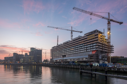
Winkel truly believes in the mixed-use concept and lives by these convictions: the Mei office is located in their Schiecentrale building, and he lives there too. The Schiecentrale 4B is a spectacular new building that wraps around the northwestern sides of the old Schiecentrale power plant. The unique shape means that every residential unit enjoys views of both the River Maas and the city of Rotterdam. The new building consists of 55,000 square metres of mixed use: it contains 7,000 square metres of office space, there are 156 live-work units whose floor-plans can be arranged as desired, and 20 ground-access quayside houses each with 3.5 floors. Additional amenities consist of a supermarket, a gym, 400 parking spaces, and a semi-public deck. The sun terrace, podium, playground and after-school club complete the complex.
Residents were able to choose their own floor-plans, even the technical fittings are surface-mounted to create maximal flexibility. The multi-use building has the characteristics of a dock structure which is interwoven with the technology of port and processing industries. The most eye-catching aspect of the project is the sheer height of the building; it is like a 50-metre-tall slab that stretches 130 metres wide and hangs over the former power plant. Schiecentrale has received considerable praise and has many happy residents and excited visitors.
Lovely lofts in monumental cheese warehouse
The cheese town of Gouda has many listed buildings that can offer a challenge to architect firms like Mei. Local cheese warehouse, De Producent, was to be transformed into residential lofts, but any kind of demolishing, extension or alteration would require special permission from the local planning authority. “It was very important to keep the look and feel of the historical cheese warehouse,” says Winkel. “At the same time, we wanted to create modern lofts that met the wishes and requirements of this time. You have to think: cheese ripens best in a dark environment, so the building only had small windows. By removing pieces from the floor and from the outside walls on both sides of the original ventilation alleys and the addition of a glass roof, we created an atrium that brings light into the building in a different way.”
Mei tried to give many original elements from the former cheese warehouse a second life. For instance, the shelves on which the cheese used to ripen were reused as a finishing on the panes in the atrium. And the trays that hung on the shelves to manage the maturation process, were re-used as house numbers. Every loft apartment is different, varying from 60 to 180 square metres. The internal floor plan of each loft was tailor-made to the individual resident’s wishes.
“Essentially, every building is its own niche,” says Winkel. “Before we created these lofts, this was an unknown type of living in Gouda and the local real estate agents told us that we would struggle to sell it. But I strongly believed in this concept and felt that it would attract new buyers to Gouda. We were proven right when all the loft apartments were sold within three months. I love offering consumers extraordinary buildings.”
Subscribe to Our Newsletter
Receive our monthly newsletter by email
