Koning Ellis architecten
Symbiosis for superb hospitality and office design
TEXT: KARIN VENEMA | PHOTOS © KONING ELLIS ARCHITECTEN
When the developers of the new Marriott Hotel in Amsterdam, Heren2 and Cycas Hospitality, required a designer for its entire interior, they knew exactly who to turn to. Floor Duijndam, from Atelier Floor, and Suzanne Ellis, from Koning Ellis Architects, joined forces and combined their knowledge in architecture, renovation and interior design to create the exact atmosphere the client was after.
With their businesses, Duijndam and Ellis are both well-established in their fields of interior design and architecture respectively, but they feel that there is a need for a more integrated approach to hospitality and office design. Amongst their clients are big chain hotels including the Marriott, Hyatt and Mercure, but they also work on public projects such as schools and other international companies, such as NBC Universal.
Two hotel concepts in one building
Duijndam and Ellis took up the complete interior design for the new Marriot Hotel in the Amsterdam docklands area. The newly built structure houses two Marriott hotel concepts across a total of 180 rooms. First there is the trendy Moxy, that attracts a younger clientele who are there for an experience. The other concept is the upgraded Residence Inn, which caters to guests who stay for an extended period of time. The building also has a restaurant, gym and spa with pool, and on the top floor, there are several meeting rooms and a bar with a fantastic view.
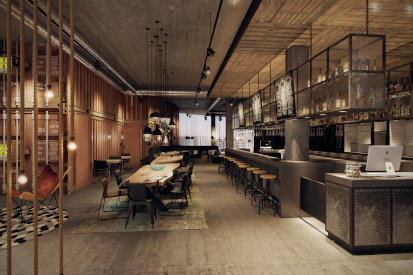
“The overall design concept for both hotels refers to the city and to the position in the timber ports,” explains Duijndam. “Concrete, wood, leather and coarse fabrics match the industrial and maritime atmosphere. In the Moxy entrance hall, we placed a real shipping container and the ceiling consists of pallets. The ground floor lobby has a famous Dutch DJs theme, as a reference to a club or lounge.” Ellis adds: “It was an interesting challenge to create a lasting environment that works for the practical hotel facilities and is aesthetically pleasing.”
The Residence Inn required a different style, much more like a luxurious home away from home. “We opted for the ‘Dutch daylight’ theme, inspired by the works of Vermeer: warm blues combined with ageing wood. This works very well together with the ever-changing clouds drifting by the hotel room windows. Not only Vermeer was inspired by these clouds,” Duijndam laughs.
The atrium forms the heart of the building: all the halls look out onto this lovely inside space where you can find large sculptures of sea creatures. Famous artist, Dutch Vincent Mock, crafted these from thousands of razor-sharp metal fish hooks. The look and feel of these shared facilities unite the two hotel concepts, and bring them together with the docklands theme.
Old building becomes local hotspot
Showing their versatility, Duijndam and Ellis were also involved in the overhaul of an old government building, located next to Haarlem Central station, that had been empty for many years. Frame Offices decided to reinvent the space as a multi-tenant workspace and asked Duijndam and Ellis for the interior design. “Before Frame Offices took it on, it was an anonymous building at the back of the station,” says Duijndam. It was on a prime location, but had been empty and overlooked. “Inside, we created an entrance area, cafe and several meeting rooms that mixes the look and feel of a hotel lobby with the business-like functionality of an office building.”
The establishment of restaurant Vooges Centraal in the building completed the total design where staff and external guests can have a quick coffee, meal or a beer with colleagues. Now it has become a popular meeting point for local residents and tenants alike. It is well-loved for its warm atmosphere and varied seating areas allowing you to mingle and relax, as well as work without being disturbed.
Creating a functional user space
In Tilburg, the local council had an interesting challenge: they wanted the closed-off, dreary back of the Tivoli car park in the city centre to be transformed into a co-working space for creative entrepreneurs, called ‘De Plint’. The new building would be partly inside and partly adjacent to the existing car park.
“The assignment was quite complex,” says Ellis. “There was only light coming in from one side and, of course, we had to follow all the current safety regulations. The numerous unusual corners and spaces, under the exit ramps, for example, proved a challenge: but in the end, this was actually what created exceptional features, such as different heights. We used brick walls and large aluminium windows that give the building the appearance of an old factory. The building makes a connection between the 1990s car park and the historic buildings that once stood there. The biggest compliment I heard was when somebody said: ‘has that building not always been there?’”
Web: koningellis.nl and atelierfloor.nl
Subscribe to Our Newsletter
Receive our monthly newsletter by email
