BOfA Architects: Small in size, big in character
Text: Eline Joling | Photos: Bofa Architects
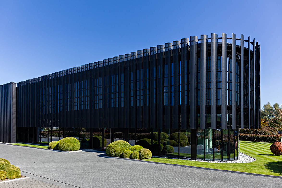
Power Solutions
Small and medium-sized enterprises might not typically be housed in the most inspiring of buildings, but the offices designed by BOfA are an exception. Developing buildings that catch your eye with just the simplest of outlines and sparing designs is where this architectural firm flourishes.
Time to get to work
Work starts for BOfA when a client wants to expand or build a new office, but doesn’t know how to approach the project. Through word of mouth advertisement they end up in front of Steven Winderickx and his team, who are ready to immerse themselves in the story of the company and its people, and design a building as if it’s their own.
Even before a location is chosen, they start developing a virtual design. “As soon as that first virtual brick is laid, it starts to come to life,” Winderickx says. “People are getting involved and employees are motivated because they can see the progress – it starts to create a great dynamic within the company.”
Part of the great reception it receives is due to how well the firm can place itself in the shoes of the client, with many of them being surprised at how BOfA managed to understand and translate the wants and needs of the company into its design so effortlessly.

Designing SME buildings
While in its essence it is still industrial construction using typically industrial materials, BOfA prides itself in the way it steers away from the basic situation of having an office building and warehouse. “I look at every design like it’s an abstract painting,” says Winderickx. “When you look at a painting it gives you a harmonious feeling, and that’s something you can translate into architecture, as well. Even though it’s only a few simple lines, it makes you feel good inside.”
The architectural lines Winderickx refers to are part of the sparse designs that come with creating a timeless look for the buildings. Take, for example, the building BOfA designed for Bellerose. Image is very important, with Bellerose being a clothing brand, and despite the building being of a certain age, it still has a strong look that catches your eye.
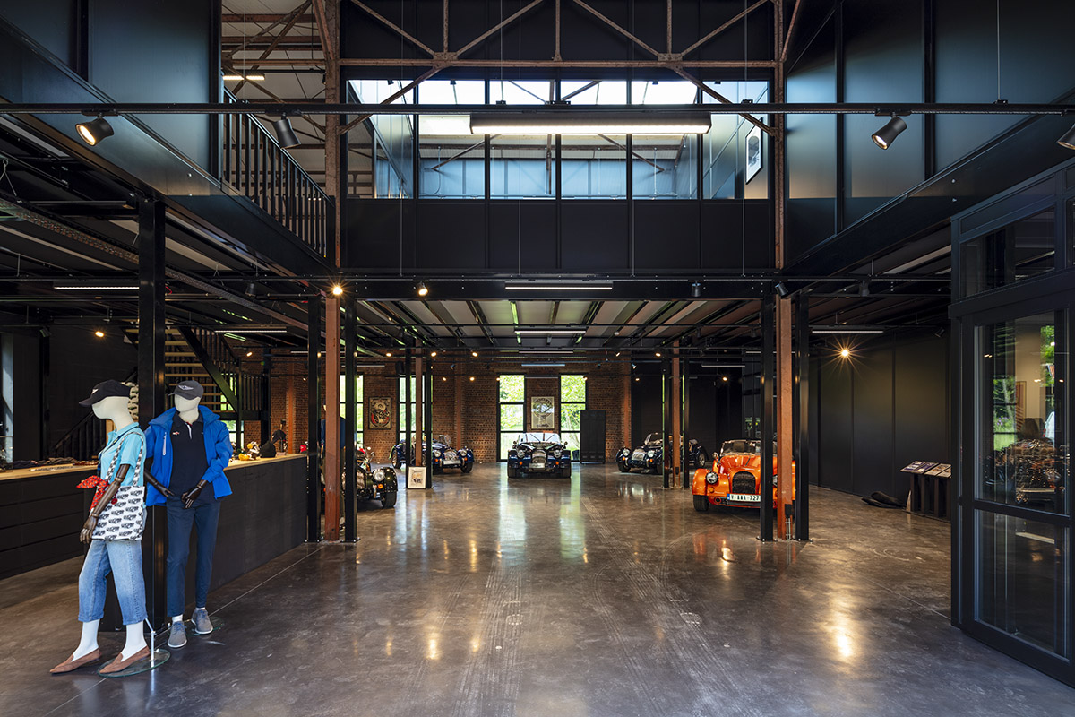
The seeming simplicity of the outer design often translates to the interior of SMEs as well. Here, BOfA works together with interior designers to play around with stunning, loft-like styles to retain the timelessness inside the building and create something completely personal to the company it hosts. For the outside however, it’s a simple but strong front with big and powerful lines – that’s about all the room to play with.

A brotherly resemblance
With over 30 years’ experience behind them, the team at BOfA has developed many SMEs that look vastly different despite working in a field that allows for limited decorative freedom. Most recently, the firm worked on two buildings that are part of a larger SME site in Wijnegem. Located at the entrance to the site, these buildings were designed to create a gate function with black buildings on either side of the street that you need to pass through to enter the site itself.
The two buildings resemble and amplify each other by using the same black material and collaborating with ventilation experts Duco, but they each have their own personalised facing wall that gives each building a unique front.
The first building designed was that for XL Boom, a company that develops contemporary living accessories. BOfA, in collaboration with Duco, created a one-of-a-kind front for the company that has both functional and aesthetic qualities. Using vertical blades of different sizes all along the building’s glass front, the blades act as a sunshade to prevent the indoor space from heating up too much, whilst also resembling a barcode that completely captures the identity of the company.
The building designed for Power Solutions hosts a similar front. Rather than the straight-on blades of XL Boom, the Power Solutions building has curved blades made out of black perforated sheet – created specifically for the purpose of cutting down direct sunlight without compromising on the aesthetics of the design.
Together, the two realisations depict exactly what BOfA is all about – unique SME buildings that add more to companies than just functionality. Located themselves in a renovated factory, it only makes sense that this old industrial building inspires the team at BOfA to steer away from banal, run-of-the-mill office designs and instead allows them to create eye-catching SMEs over and over again.
Subscribe to Our Newsletter
Receive our monthly newsletter by email

