Binst Architects
Balancing modesty and expression
TEXT: EVA MENGER | PHOTOS © BINST ARCHITECTS
With 45 years of experience across a range of disciplines, Belgium firm Binst Architects is in a stronger position than ever. Being able to take on any type of project is their unique selling point, but there is some continuity: everything they do falls under ‘abstract expressionism’, or, a healthy balance between intelligent modesty and controlled expression.
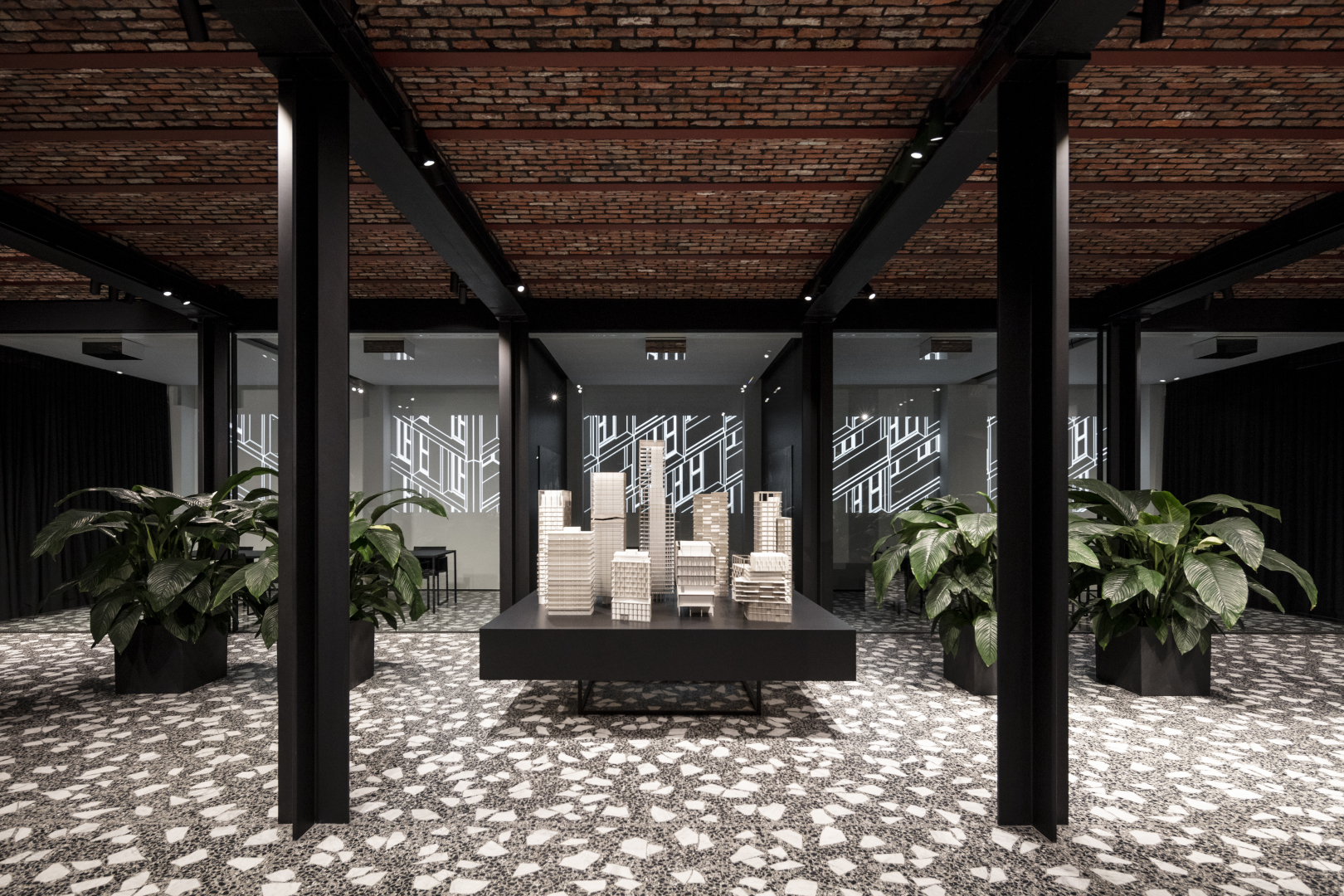
“Like most firms in Belgium, we were hit hard during the 2008 global financial crisis, which is why we decided to open up and widen our focus,” director Luc Binst tells us. “We’ve come a long way since then. Our team has nearly doubled, we’ve moved into a fantastic new office space on Luikstraat in the heart of Antwerp and at this very moment, we’re working on over 800,000 square metres worth of projects.”
While a wider, multidisciplinary focus technically means that they can take on anything, the team at Binst Architects feels most affinity with high-rise buildings, group housing and headquarter architecture. What most of their projects have in common is that they radiate ambition: “We like to see ourselves as the most dynamic and ambitious architecture firm of Flanders,” Binst states firmly.
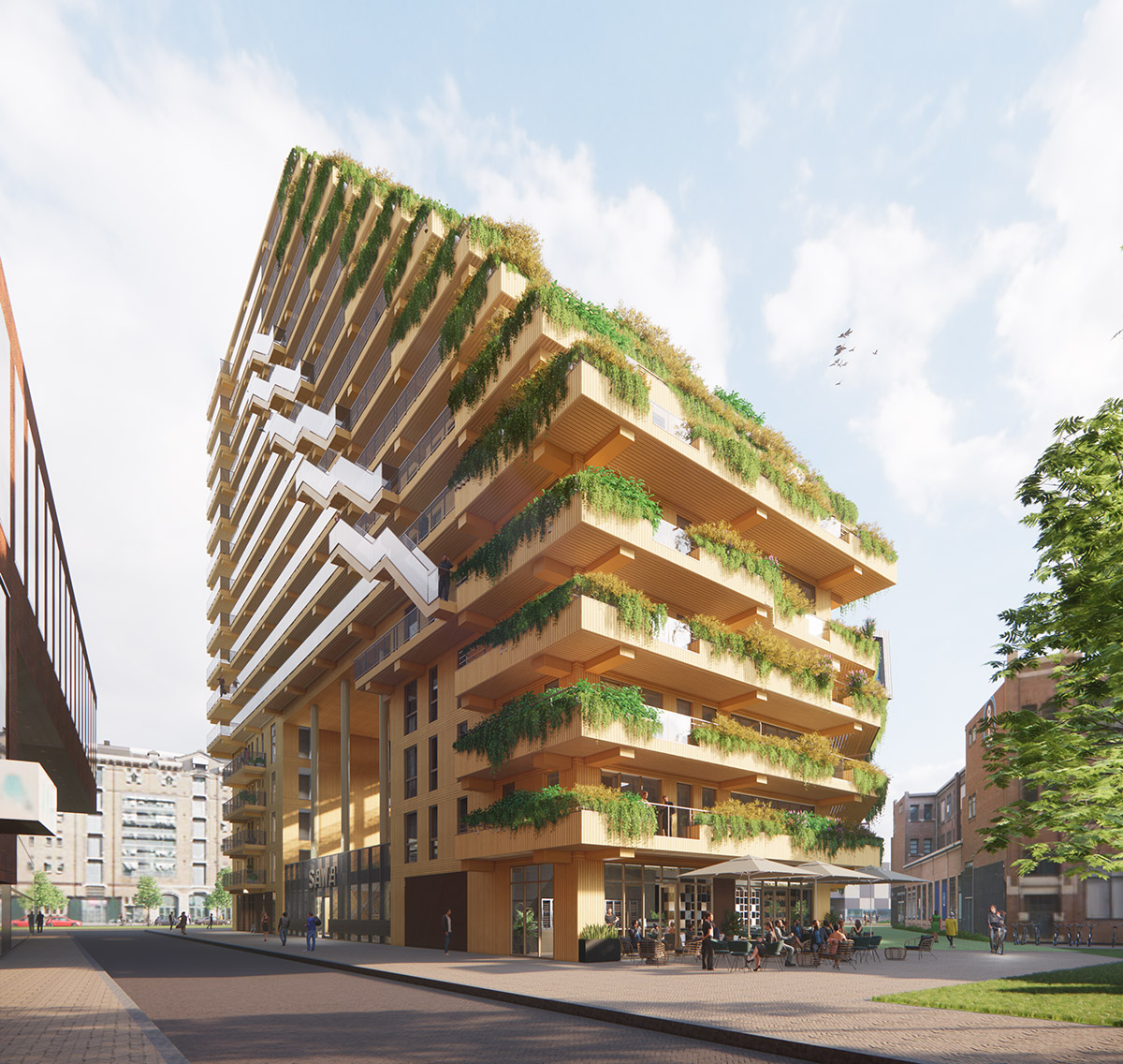
That this is hardly an overstatement becomes clear when looking at the Doktoren (dock tower), set to be built in Antwerp next year. “Traffic is getting worse every day, as are wider environmental problems,” says Binst. “That’s why we’ve been looking at sustainable and effective ways of making the most of the space that we have. High-rise buildings will help the city open up, while light materials and trees on top will make for a seamless integration with nature.” With its lean sculptural attitude and striking asymmetric shape, the tower is bound to be a statement piece.
Binst: “Another high-rise building we’re very proud of is the Strijp-S in Eindhoven, which was commissioned from us by Philips. Here, we’ve tried to create a miniature Manhattan by playing with different heights and shapes. Rather than being a random building in an otherwise mostly low-rise environment, it naturally fits within its surroundings. Architecture is all about balance.”

The final design of De Persgroep headquarter.
The face of a business
Binst Architects also know what it takes to visualise a multinational’s business card. Whether it is Cordeel (one of Belgium’s largest construction contractors) or De Persgroep (a leading media agency in Belgium), Loyens & Loeff (a Dutch law firm) or Belgium building company Denys: their headquarters are all phenomenal, and they have Binst Architects to thank for that. “Being asked to design someone’s headquarters is an incredible honour, and really motivates us to look for added value, architectural identity and inspiring authenticity,” says Binst.
Cordeel’s headquarters is both aesthetically pleasing and incredibly practical. It was designed as an addition to their utility site and is thus centred on providing a clear, panoramic view. Two office blocks were placed on concrete units, 73 metres away from each other in order to create a building that was both high and wide enough. Each office block counts 2,300 square metres and is glazed from floor to ceiling, creating an office that is spacious and multifunctional.
“De Persgroep held an open competition for their new headquarters, so we closely studied the square on which it was to be built and translated our findings into an architectural icon which actively engages with its environment,” Binst explains. The atmosphere of the surrounding station area will be altered, and the building’s highly dynamic design will strongly connect to current urban developments in nearby streets.
On the inside, the building offers a spacious and comfortable environment with a restaurant, various coffee corners and multimedia pop-ups representing the 24/7 economy of the companies’ core service. “De Persgroep is internationally renowned, which we wanted to highlight by predominantly working with sustainable and contemporary materials,” says Binst. Ultimately, the building is to express the dynamic and buzzing nature of a press agency, both inside and outside.

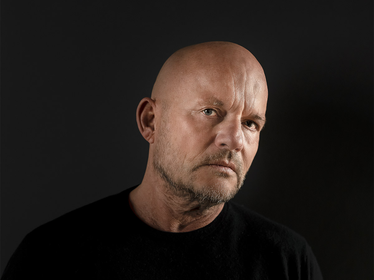
The Binst Architects team, currently formed of 50 ambitious employees. Photo: Herman Desmet
Residential innovation
The above examples all evidence a portfolio full of majestic and brave architecture, but the team at Binst Architecture has a thing for residential spaces, too. “We are very interested in developing smart living spaces. The question of how to make innovation a practical, daily feature is one that often keeps us busy,” Binst admits. “It is our task as architects to always be conscious of evolving living and construction methods.”
An excellent example of that is Residence Melopee in Antwerp, a residential block comprising 32 luxurious apartments built right in between the Schelde river and the Belgian equivalent of London Bridge. It is a beautiful corner block on the southern part of the new island, and a funky and contemporary interpretation of the existing warehouse typology. Binst: “It’s really where graphic design meets architecture. V-shaped white brick columns are subtly wrapped around the apartments like a folded envelope, which makes the building stand out in a very modest way. The residence has an elegant, fresh and dynamic appearance which perfectly suits the little island on which it is located.”
Binst Architects is never short of ideas. In fact, their main goal for the future is to become even more creative than they already are. “Expanding our signature, that is what we want to focus on in the next few years,” Binst confirms. We cannot wait to see what else they have in store.
Subscribe to Our Newsletter
Receive our monthly newsletter by email
